My Favorite Characters and Why They’re Effective
Previously I took a look at the case for character design and why it can and should be used as an effective marketing tool. Some of you may have been left wanting to know more. I went into detail about Tama of Wakayama Electric Railway, BaM (Bob & Mike) of BIGGBY, and Dave & Wendy Thomas of Wendy’s, so today we’ll be talking about more of my personal favorites and going into more of the fantasy side, because all of the previously mentioned characters were based on real personalities (I would say people, but Tama is in fact a cat).

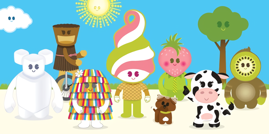
First up is Kernie and friends.
Company: Veer
Why I like them: Taking the concepts of graphic design such as type layout, photo selection (or photography) and editing, and print and creating characters is a sure way to make me fall in love with your brand. Well, that, and releasing fun activity books each summer. The fact that each of their STYLES is also different depending on what aspect they’re supposed to represent is quite the touch. Plus, Kernie is just so cute!
Why it’s effective: Well, sadly this one was not AS effective as I would have liked. I found next to no data on #kerntheplanet, the biggest part of this fun campaign, and if you tried to find the company at their website, ideas.veer.com, you’ll notice the brand is totally defunct.

Without having a solid reason as to why they shut down, we have nothing but speculation.
However, if we take a look at Drew Ng’s (the designer behind the book) website, we can see that his iconic work has won quite a few awards during his time at Veer. And he didn’t stop… his career really took off during and after that time based on the work he displays on his website!

Japanese Anime x Product Collaborations
Companies pictured: Fate/Stay Night (glasses) and Steins;Gate (cafe)

Why I like them: While Americans can get a taste of their own version of this (Disney and Marvel products, Pokémon craze, etc), what happens in Japan, like many of their trends, is truly special. There’s something magical about opening up a household item, snack, or otherwise useful item that just so happens to have your favorite character’s face on it, kid or grown-up. You could even go really wild and have lunch at a character café!
Why it’s effective: As I touched on in a way with my previous post, the reason that Japan continues to employ this methodology is because it’s effective. Anime, in its absolute behemoth-like array of genres, ranges from liked casually to beloved by fans all around the world. One thing that anime fans can all agree on is that this medium does a really good job of getting its viewers attached to the characters. If a customer is attached to a character, they will want to buy a product featuring said character, of course.
Additionally, using anime as a crossover essentially opens a world of cross-promotions, which, we know from the basic retail world, WORKS.
For more on this concept, click here.
The “Jazz Man”
Company: Zatarain’s

Why I like him: Remember how I talked about racist caricatures in character design? A few companies may be going “oh, I didn’t know (x) was racist. How can I design a person of color, and in particular, a Black person, as a mascot who’s not racist? That seems really difficult.”
Actually, it’s not.
“Jazz Man”, though unnamed, is slick, stylish, and ideal to recognize. He doubles as a logo and a mascot, and anyone can imagine themselves “jazzing it up” along with him.
Why he’s effective: He’s simply designed and dynamically posed, and fits right in with the brand. He’s full of culture, and best of all, fun! If you want consumers to buy your rice for jambalaya, gumbo, or another Creole-traditional dish, “Jazz Man” is the best way to encourage them to. Now, if he could just have a name…
Lucky the Leprechaun
Company: General Mills
Why I like him: Lucky, along with his other cereal mascot friends, are adorable and a callback to historical/vintage design techniques. They’re of the “you know ‘em when you see ‘em” type of design that everyone aspires to have and/or make. However, Lucky is my very favorite out of these because of his link to Celtic mythos.

Why he’s effective: If you have or know a kid, you know that they love to be engaged. They’re just like anybody else, but they have a few less rights, and marketing to them gets into the stickety-wicket territory. However, I believe that kids have the right to think for themselves, so some marketing, as long as it’s done in an ethical manner, is okay. If you have a story behind your character, and encourage your audience to respond to the story/character, you have an engaged consumer. Is it any surprise that these kiddos love their Lucky Charms? Additionally, he’s so cute and iconic that he’s inspired a group of artists to animate a short based on him and his story.
Konqi & Friends, Inori Aizawa (Computer/system mascots/“OS-tan”)

Companies pictured: KDE Community, Internet Explorer (yes, THAT Internet Explorer!)
Why I like them: I started this entry under Inori Aizawa initially, because she’s the first mascot for a computer/system that I really became aware of, and she, and her story, are kick-ass. If you’re not familiar, you should watch the video below.

However, as I began to research, I realized she was hardly the only one to be personified in this way. Anthropomorphized? Characterized. In any case, there’s a whole Wikipedia entry dedicated to these guys, ranging from Tux of Linux fame to Wilbur of GIMP. (Hey, where’s the Finder guy?) I LOVE the KDE dragons unabashedly. They are so cute!
Why they’re effective: The reason Inori is effective is because the character really clung onto the personification that the community gave IE (slow, kind of ditzy, prone to attacks by techno-garbage such as viruses), and transformed PAST all that. Well, mostly. But Inori totally blew IE’s image out of the water, despite her being an unofficial mascot.
As for Konqi, the different actions that they’re taking go along with the shapes of their antlers (look closely). And speaking of symbolization…

Sumi, Quatchi, Miga, & Mukmuk
Company: Vancouver Olympics 2010
Why I like them: Okay, these guys are stylish AND cute. (You got me, I might have a thing for cute characters). Plus, not only are they animals (real and mythological… just like Pokemon!) from different parts of Canada, but they also mean different things, depending on what element of their personality or makeup you’re looking at. They represent different First Nations peoples, and have favorite sports all of their own. And hey, doesn’t their charm look a little familiar?
Why they’re effective: Their simple design makes their joy infectious to spread. The fact that they’re really and truly representing the native peoples of the Canadian land is absolutely part of their success;
the fact that the team took such care into what stories, creatures, and elements were important to them is integral to this design set, and if you look to represent people of any race, that should be your lens to approach, too.
After all, we can easily see what happens when we don’t… and I will expound on that in a later article.
Pathfinder Goblins
Company: Paizo Publishing
Why I like them: These guys are quirky and fun. They are true to the goblin mythos of greed and gold-hogging, while subverting harmful and anti-Semetic tropes about Jewish people that this race often falls into (cough, cough, I’m looking at you, J.K. Rowling, though others are guilty of it too). Their long ears make them charming, actually. There’s even a plush of one! Who could say no to that?!

Why they’re effective: It’s all about the story! Paizo managed to make sympathetic goblins because at heart they apply to base human nature, instead of just making them “another enemy”. Thanks to fan outcry, goblins then became a playable race instead of having to be specially ported, fueling the fire for yet more adventurous storytelling…
Well, that was my special character lookbook for now. I took a look specifically at fantastical characters today because they happen to be a special favorite of mine. At some point I will come back and talk about spokespeople for brands, but for now we’ll leave on that note.