Capitalizing on the Personal Connection
In previous articles, I discussed the beginning concepts for character design meets marketing campaign efforts, and some of my personal favorite mascots. I’ve had a few people reach out to me over the years and ask how they, too, can take action in a methodical way to achieve their own memorable “character”. So today I’ll walk you through how I create a character, tying it into marketing methodology and giving you a behind-the-scenes look at my own branding.
Step one: what’s your character like?
One of the first things I ever do before I even begin the base, or the “skeleton” of the character is to determine how I want that character to act and be like. Some call this personality or character traits, but if you’re in marketing like me, you’ll want to use this time to select an archetype. If you’re using yourself as the character, you’ll just want to select the best of you! It can be hard to tuck yourself in a box, but it can also be hard for some to expand a personality type into different traits and behavior. Don’t stress… the biggest and the best brands have changed over time as will, undoubtedly, your own.

Naturally, as someone who thrives off of ideas and creation as a concept, my brand, and character, can most easily be described by the “Creator” archetype. Runner-up concepts include the “Jester” and the “Magician”. So what makes me, me? I chose qualities such as imaginative, bouncy, and engaging, all true to my personality, to select this archetype.
I encourage you to use your favorite search engine to read about brand archetypes once you’re all done here so you can get started on your own brand journey!
Keep in mind when you’re coming up with a personality that a story is paramount to how character traits are founded and grow. And it is this story that makes audiences want to connect to your character, so it better be good!
So, for instance, maybe you’ll want a simple story about how your character is looking for X, where X is your product. This works for kids’ brands, but how do you advertise a more mature product, like coffee or computer parts? If you’re using the spokesperson approach, think about how they’d either publicize their life, or how they might answer in an interview when the hiring manager asks them to tell them about themselves.
And if your character is a more cartoony or silly one? Maybe they ARE looking for just the thing to file their best-ever tax returns!
Step two: picking a style.
I’ll give you a few hints: you start broad and go down to the nitty gritty. Do you want a more simplistic style, or more complex? How thick are your lines… or are there any? How abstract do you want to go? How about realistic? If you’re deciding to go cartoony, what style do you want… an East-meets-West feel, a comic hero, a floppy-limbed big-eyed character (think anything from Adventure Time to Star vs. the Forces of Evil)? At LEAST as much thought should go into your character as goes into your logo. Some people will still need help, and that’s okay! Those “some people” should be sure to reach out to a graphic designer (like me!) for help. For those who are undaunted, read on!

Because I work SO often in an Eastern-influenced style (Japanese anime and the impact it inspired), I chose to make my character an anime character.
This article is by no means an endorsement of every brand becoming an anime…
(though that could be cool…)
But even if you’re looking at a more simple take, Simone Legno and his art line Tokidoki presents a wonderful example from right here in the States. Pictured are two of the figures from his Unicorno series.

If you’re looking at creating a more “anime” influenced brand character, and want to diversify styles a bit, I would encourage you to take a look at the Sanrio x BNHA collaboration pictured. They… are here! (Sorry, couldn’t resist).


If you’re well versed in 3D services (or ultra successful) it might behoove you to have a “realistic” rendition of your character. Take a look at the highlights and shadows! The smooth ripples of the Ms, the scales of the Geico dude. They take the space and claim it. As you can see, neither began as a 3D character either. Trust your journey with your character and let them evolve as you grow your business.

Whatever you choose to be inspired by, be sure not to IMITATE it… at least, not at the end. It’s no fun being inauthentic, and it’s no fun having to pay legal fines either! Be sure your style ends up being 100% YOU.
Step three: forming a “base” for your character.

Again, if your character is just you, this should be pretty easy. But you also have to consider different shapes. If your character is more of a fun one, you may want to draw more dynamic poses. If you want to go for more of a “homely” feel, you should stick to a bust or portrait shot, although you are certainly more than welcome to expand from that in a sketch. I included my Schoolhouse Rock-inspired rendition of Bob and Mike here because they’re another perfect example of what YOU, YOURSELF as a representative character would look like. But Colonel Sanders’ rendition does prove that the character does NOT have to be cartoony! If you consider yours to be a more serious-faced brand, you will want to go with less color and more striking shapes… just like the colonel.

Or is your character an animal or object? That’s perfectly valid too. Just make sure that the little guy (or gal) presents a personality trait suited for your brand. And above all, don’t forget that smile!
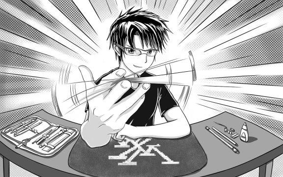
As you can see, I’ve illustrated a rather quick base for my character so that you can see the basic shapes that go into such a model. If you’re using yourself, your sketch will be a cross between a caricature and a “your face here” style drawing – the best traits of yourself, but exaggerated. Is my hair that messy in real life? Nah, not really. But it makes a fun way to top off my character.

Step four: the color scheme.

Here’s the fun part! There are a TON of ways you can implement color into your character. Maybe you want to match, or at least play off, your logo. MSI certainly does that with their “lucky dragon” character!
Or maybe you want to have a high contrast character, if not entirely black and white. Not only did Apple approach this in their first iPod ads, but anyone, if asked, would probably recognize this black and white portrait of Steve Jobs, Apple founder.

Additionally, you could go full color. Full color anything-you-can-imagine is easier than ever these days, and makes your job of character colorist so much easier.

Now… decisions, decisions. What colors do you go with? It’s no secret that colors mean things, and can convey emotions, feelings, and even requests. This concept, which is what’s known as color psychology, should absolutely go into how you decide to color your character.
Step five: finishing touches.
I’m not going to sit here and tell you how to finish your drawing. There is no wrong way to make a character drawing become ready for process.
Actually…

Just like your logo, it’s imperative that your character be in a vector format. If this isn’t achievable, you should at the very least make your character a high resolution PNG. I use Adobe Illustrator, but that’s just because it’s what I’ve been using since I was a kid, including all my days through graphic design school. Just because I use it and it’s tending to be industry standard does not mean you have to use it.
Take a look at this link to see the specs, pros, and cons for some trusty Illustrator substitutes.
NOW is the time to unleash all that you’ve learned about style, color theory, character design, and so much more!

Are you having difficulty, or did you come up with ideas for your very own character? Want to see even more content? Do you have questions about character design or marketing you’d like to see me answer or elaborate on?